Galactic Ventures
Playtime - about 30 minutes.
Goal - make your business grow big and spread through the galaxy (1e60 credits).
Hold LCtrl to make bulk purchases.
| Status | Canceled |
| Platforms | HTML5 |
| Rating | Rated 3.5 out of 5 stars (4 total ratings) |
| Author | xyperine |
| Genre | Simulation |
| Made with | Unity |
| Tags | 2D, Casual, Idle, Incremental, Indie, Sci-fi, Short, Singleplayer |
| Average session | About a half-hour |
| Languages | English |
| Inputs | Mouse |
Development log
- v0.1.1Oct 03, 2024


Comments
Log in with itch.io to leave a comment.
Dragging the upgrade window to the top, under the top bar, prevents it from being dragged again.
Besides that and what everyone else has said, the game was pretty enjoyable.
First of all, the music amazing. That drew me in right away and kept me playing :)
I agree with the feedback below about menus closing each other. It would be nice if there were hotkeys for opening the windows but that would be a nice bonus, not mandatory.
The biggest issue for me is the progression of the game. The most effective way to progress is to use scrap -> minerals -> prestige. This gets particularly effective when you prestiged some times, unlocked some upgrades and amassed knowledge and connections. After the early stage you can prestige after 1 or 2 clicks and rinse and repeat, and that lets you grow very quickly and effectively especially in comparison to trying to get to your previous progress.
I guess this is why many idle games let you prestige only when you come close to your previous progress and surpassed it at least a bit.
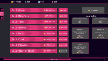
the other thing that bothered me a bit was that only the latest business/resource is relevant. there is no reason to invest in minerals when u have tech or in robots when you have meds.
so, as mentioned, it might be nice to give upgrades for lower resources to let them stay relevant.
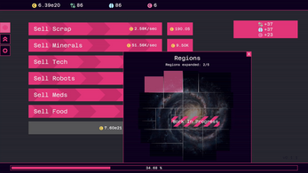
OR and that would be more fitting with the existing system and presentation of the game, it would be cool to expand the regions-menu.
an idea would be to divide sectors into subsectors, and possibly even add trade routes. and different sectors could focus on specific resources. so lets say the sector alpha-centauri focuses on minerals and scrap and each sector boost your whole income by a bit, but your scrap and minerals income by quite a bit. and upon aquiring all subsectors you get an effect of monopoly that exponentially increases the income of said resources. this way low tech resources could stay relevant, surpass higher tech in the mid game and late game be overshadowed again. also it would fit with the whole business vibe
it might be also fun to allow non-linear progression of sectors, so you could expand into multiple sectors, and it is not so easy to build a monopoly in a sector/resource.
trade routes could be something that you unlock when you have different sectors and establish connections in between.
Lastly it might be nice to unlock permanent upgrades not only with prestiging, and tau coins, but also with certain progresses of the game. so either aquiring a full sector might stay permanent, or at certain milestones, e20 e40 e60 you get different titles like business, enterprise, megacorp or smth, something to work towards to. because like I said currently the most efficient strat is just to stay at scrap and minerals and keep prestiging until you know u have enough connections and knowledge. all the other content is only needed when you need to finally reach a certain gold count.
all in all, fun game in its early stages, but great music and lots of potential :D
Thanks for your feedback! These are some solid ideas! I especially like the milestones one.
To make early businesses more relevant I have already planned a new feature, but I think I’m gonna add more buffs for them like business-specific upgrades, or multipliers every x levels, or as you suggested buffs from regions, etc.
Nice game! I have a LOT to give feedback for:
For the UI:
The tool-tip being transparent is a nice touch, BUT they get hard to read with the filling bar behind, since they have similar intensity levels (the bar and the text). Up the alpha a bit or add more separation (so they don't overlap).
Onto the filling bars, I would like to separate the buy button. When lit (affordable), they are almost indistinguishable from the filling bar.
Move the gain on buy onto the buy button, so there's only the current production number on the bar. As it is now, it gets confusing as to what is what. The plus sign should be used for the gain on buy, not the other way around.
The color of the filling bar is too intense. You may want to add an epilepsy warning, or tone it down.
Add a buy all button. On games of this style, they are a must. More so since it's fast paced.
The windows. They should hide/close the others. As of now, the settings window is on top of the upgrade menu, on top of the expanse menu. You can't access the window bellow without closing the one on top. Add also a close window button. Moving the pointer back and forth is not the user experience you want to give the players.
At some point the bulk buy stopped working. You may want to check on that. I tend to switch windows/tabs a lot on my PC.
Onto the actual game:
I don't know were you live, but food business should be up or above the mineral one.
There's a serious unbalance between the first businesses and the last ones, starting in the order of 10^12. This means they quickly get irrelevant in the play-through. Try to add more upgrades for the first businesses.
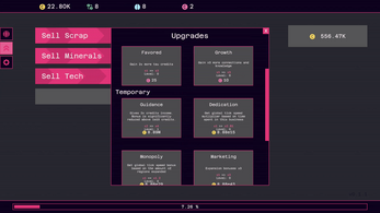
The upgrades. Move the temporal ones to the main area, you have the space. The limiter for early credits is too low, makes getting levels 2 and 3 irrelevant after a couple of prestiges. You may want to remove the limiter completely.
That will be all for this time. Don't feel pressured nor down. It's a good game overall!
Thanks for your time and feedback, glad you enjoyed the game! I’ll be addressing these issues in the upcoming patches.
Maybe make the limiter a reduction, so it affects things less over 1e15?
Yeah, this sounds like a good idea